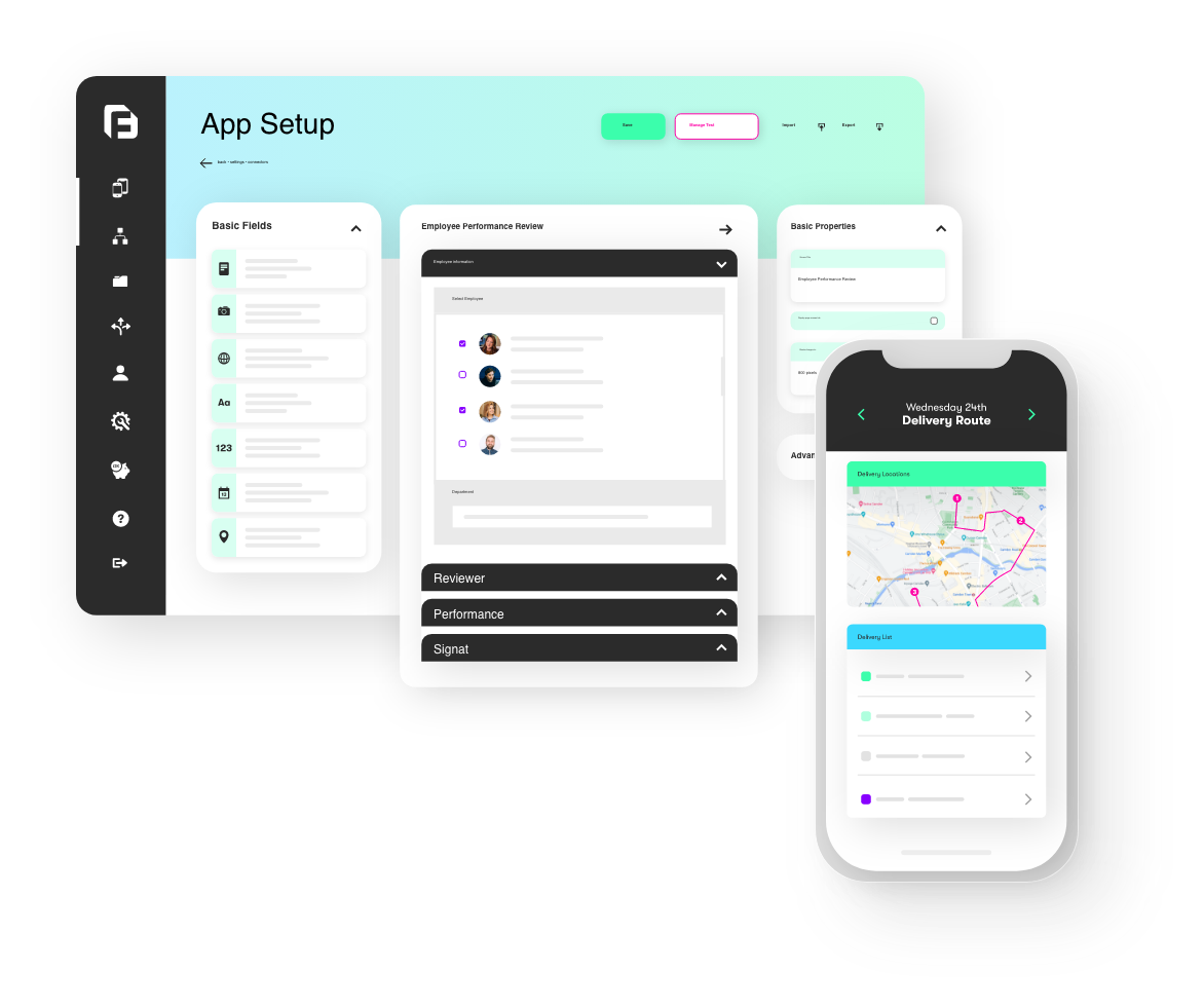
We’ve just made some major screen upgrades available on the platform that will add a lot more choice for viewing and selecting from data sources on your apps. Headlining the batch is a brand new Screen type called… the Mapping screen.
Mapping a Data Source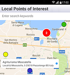
The new Mapping screen is a fully fledged screen type in its own right. It provides users with the ability to display Data Source rows as pins on a full screen sized map. We’ve added lots of customisation options so you can control pin colours, call-out display and user interactions to faciltate dynamic scenarios when the user selects a pin on the map.
Smart clustering of data pins means that the Mapping screen can display thousands of pins while remaining responsive and engaging to your users. This should provide another level of flexibility and productivity to your apps.
New In-App Filtering Options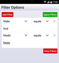
We actively encourage suggestions and feedback from all our lovely customers and a frequent feature request is the ability for app users to filter data displayed in Listing screens. With this update, filtering is now possible! It begins with the ability to turn on Filtering screens on the app for both Listing and Mapping screen types. To do this simply check the “Allow Filtering By Column” box within your form.
When filtering is enabled, a new icon will appear at the app in the search box of the Listing and Mapping screens. Tapping the icon takes the user to a new app screen that will allow them add a maximum of 3 custom filters which is then applied to the data. Filters are also now “sticky” which means they are retained by the app for subsequent times when the screen is re-opened. The filtering input fields display is also dynamic depending on the data type of the column (as set-up in your Data Source -> Rows page on the secure website).
Advanced Data Source Column Settings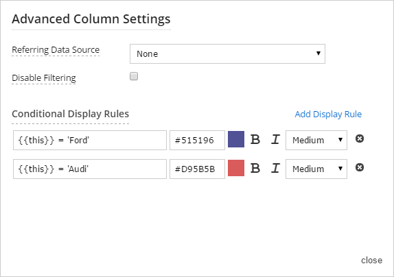
To enhance control of how the Data Source filters and rows are displayed we have introduced a new Column Settings dialogue which is available on every Data Source column within the Data Sources -> Rows page. Just click on the settings icon within the column heading to open the new dialogue. New options available here include:
Referring Data Source: This allows you to specify another Data Source which contains the possible values to appear in this column. If you define a Referring source, the Filter screen in the app will automatically display those possible values as a drop down list of options instead of defaulting to text entry.
Conditional Display Rules: We now have a brand new layer of display customisation for Data Source values. Rules can be defined to make column values appear in different text styles and colours depending on the result of a formula. For example, if you have a Status column with three possible values – Decline, Review or Accept. Defining rules for these enables you to display Status values in different colours to emphasise their purpose. The rules can also be used on Mapping screens to colour pins, in Listing screens to vary the data value display and are also automatically applied in Form screens when you use a Choices field with List of Choices display style.
Listing Screen Enhancements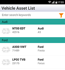
The Listing screen type has been given an overhaul and contains new features which will allow you to build even better app experiences for your users. New features include:
Right side display positions: Now you can display column values in 2 new right aligned positions on every row in a Listing screen.
Text Styling options: Every text display position on a Listing screen can now be styled via colours, font size and style of your choice. Additionally you can use the Conditional Display Rules feature to produce dynamic display on rows based on the column value.
Better Grouping and Sorting: You can now control the order and display grouping of rows in a far more granular fashion. There are also new options to control the display of group headings to produce eye catching app results.
Set Your Own Title Bar Buttons: You can now set two right aligned buttons to appear in the app title bar, letting you add more navigation options for better user experience. You might want to let the user view a Data Source within a Listing screen and a Mapping screen. You can now quickly add a “Map” button to let the user easily jump between screens.
This is one of our biggest single updates to the app and web platform with many improvements to functionality that we hope will help you build even better apps in the future. We’re looking forward to hearing what you think and seeing the cool new screens you build with these improvements